
01 —
Users Were Guessing Their Way Through
Step 3 and 4 created the most friction. Users paused, reread labels, and guessed what to do next.
Redesigning Unduit's Refresh app to make device recovery and buy-back flows intuitive, guided, and error-free.
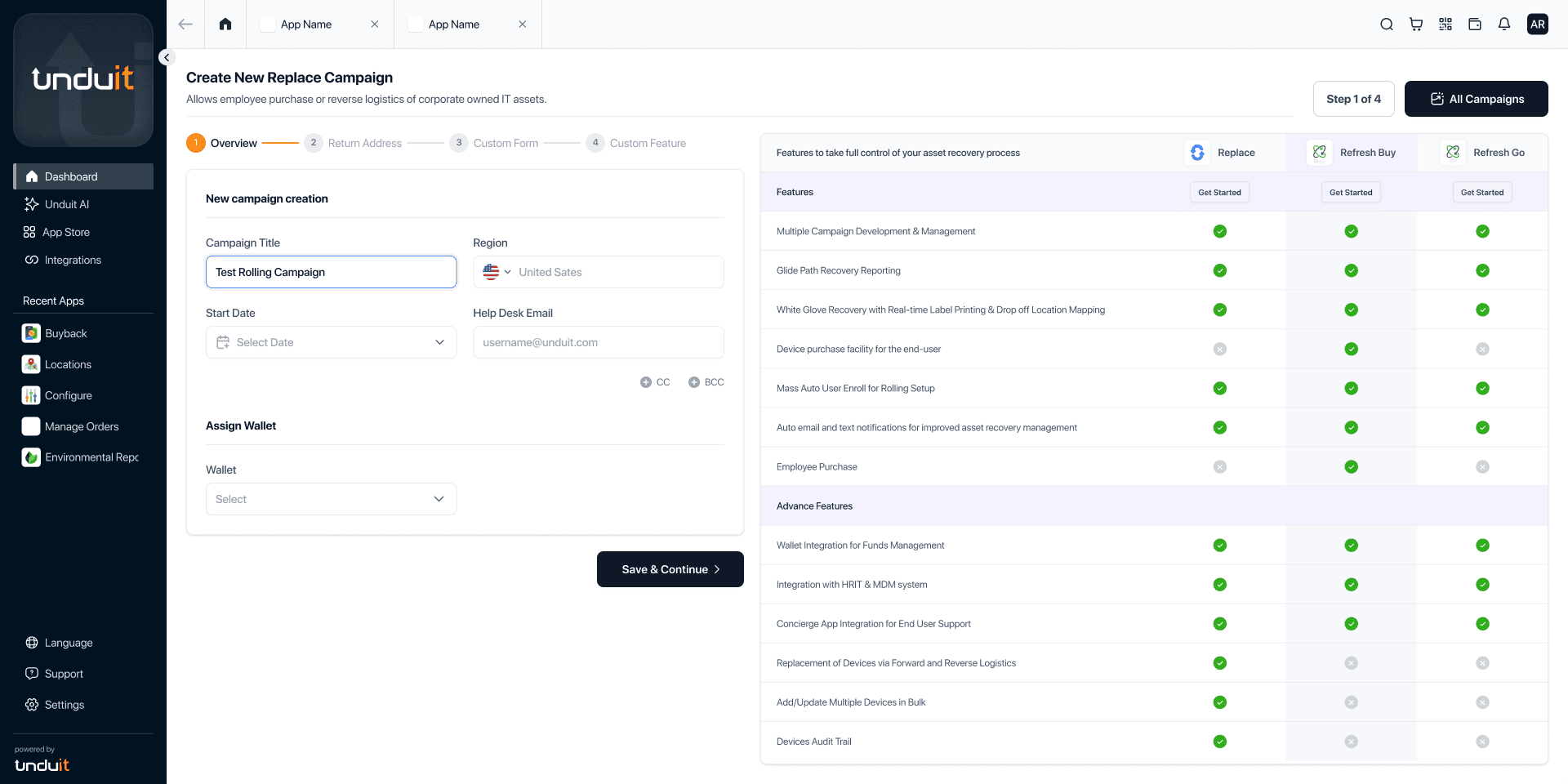
The Refresh app helps enterprise IT managers configure device recovery and buy-back campaigns. This case study focuses on redesigning the setup experience to reduce errors, eliminate confusion, and make complex workflows self-explanatory.
Role: Product & Visual Designer · UX audit, UX writing, UI simplification · Web app
.avif&w=3840&q=75)
For an IT manager at a Fortune 500 company, time is the most valuable resource. The original Unduit app was costing them hours of frustration.
Confusing labels that failed to describe the next action.
Irrelevant 'comparison panels' that added visual noise.
Non-linear flows that allowed users to skip critical data points.
Research & Insight
To understand why users struggled during setup, I conducted usability testing sessions with first-time users from the target audience, including IT and HR managers.
The sessions focused on observing how users navigated the flow independently, where they hesitated, and what created friction during the setup process. Since the company was actively investing in growth and marketing, the onboarding experience needed to feel intuitive and self-guided for completely new users entering the platform.
Alongside usability testing, session recordings were analyzed through PostHog to identify repeated patterns, confusion points, and behavioral drop-offs across the flow.
01 —
Step 3 and 4 created the most friction. Users paused, reread labels, and guessed what to do next.

02 —
The comparison table pulled attention away from setup, adding cognitive load instead of helping decisions.

03 —
Users kept moving back and forth to recheck choices, creating unnecessary effort and confusion.
Core Insight
Users didn't need more information. They needed a flow that clearly guided them through what mattered, in the right order.
Transformation
Drag the slider to compare the original interface with the redesigned version.
.png&w=3840&q=75)
Strategy
Steps structured in sequence. Critical configuration cannot be skipped.
Microcopy explains intent and consequences, not just labels.
Visual noise removed. Focus on decisions that matter.
Final screens

A welcoming intro that sets expectations before users dive in.
Everything at a glance — progress, actions, and next steps.

Where devices go when employees return them.

Guided sequence ensures nothing important gets skipped.
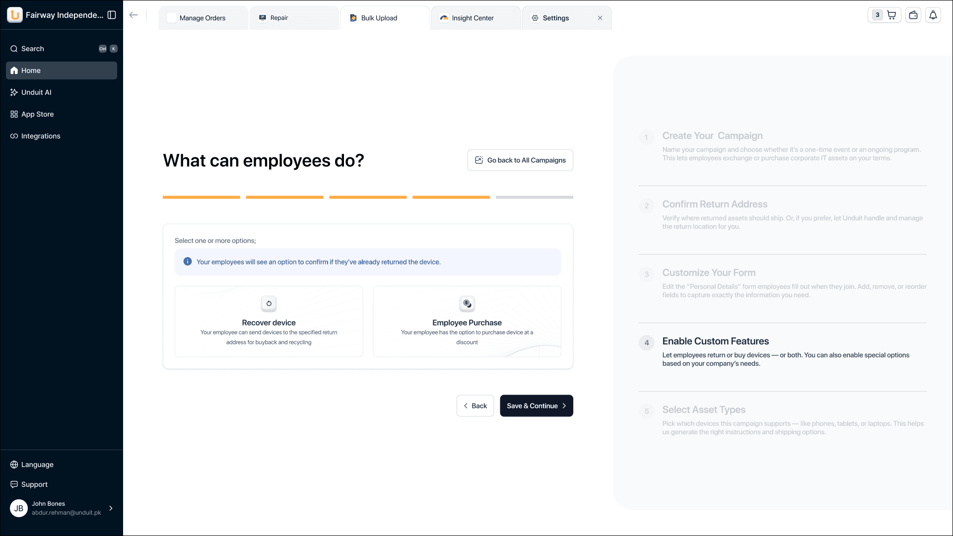
Capture exactly the data you need — nothing more, nothing less.

Define what happens next — keep, recycle, or return.

Laptops, phones, tablets — specify what gets recovered.
Design Decisions
From dropdown friction to one-tap selection
Eliminating unnecessary clicks
Setup completed ~30% faster on average.
Configuration errors reduced by ~45%.
Noticeable decrease in support tickets post-launch.
Reflection
This redesign shows how guided UX, strong writing, and restraint can directly reduce operational load.
Contact me